One of the most useful front-end development techniques of recent years is the humble “CSS Sprites”. The technique was popularised by Dave Shea on A List Apart in 2004 with his article
CSS Sprites: Image Slicing’s Kiss of Death. CSS Sprites are a relatively simple technique once you understand the fundamentals and it can be applied in all manner of ways. A common use is for a graphic intensive navigation, but it can also be useful for buttons or even styling headings with the corporate font.
Sprites are simply a collection of images which are merged together to create a single file. You then use CSS, changing the background-position the image, to display the correct part of the image you need. I often use the analogy of a large object passing a window — you only see what is within the frame.
Over the last couple of years CSS Sprites has been one of the most widely adopted CSS-related techniques. Popularised by the Yahoo’s research and documentation around
speeding up your website, many high profile websites implement the technique, including Google and Amazon. There are
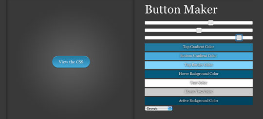
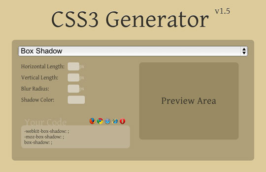
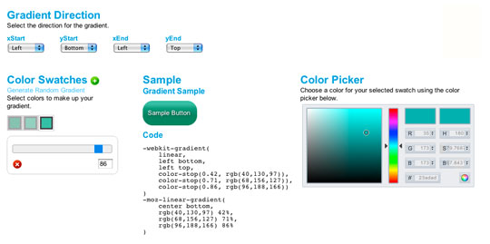
numerous tutorials which help you get to grips with the techniques and
sprite generators which help you create the graphics themselves.
The Benefits and Potential Problems
CSS Sprites have become a de-facto way of improving the speed of your website or web application. Merging multiple images in to a single file can quickly reduce the number of HTTP requests needed on a typical website. Most browsers only allow for two concurrent connections to a single domain so although individual files can be large, the overall request and response times are considerably lower. Combining images with similar hues also means the colour and compression information is only need once, instead of per file, which can mean an overall reduced file size when compared to the files individually.
The benefits of reduced file size and HTTP requests are often publicised, but potential problems are rarely ever discussed. One of the main techinical issues with CSS Sprites is memory usage which is explained in the article
“To Sprite Or Not To Sprite”. Another issue is the maintenance of the sprites, the images and the CSS, both of which can become rather complicated.
A Technological Solution
A common practice in solving slow-down in computing seems to simply
throw in more hardware. We all know hardware prices are dropping all the time, so this seems like a reasonable solution. However, I feel there is a fundamental flaw with this philosophy and ingrained mentality. Developers have access to more computing power and as such they code their applications to be handled in these environments. With each new feature the application becomes slower and slower, but this problem has already has a solution — upgrade your hardware.
This is an endless cycle.
Many of the user interfaces people come across today are on the Web. This means the user has to download most of the related material (images, CSS, JavaScript) before interacting with the content, so the same philosophy must be applied to the Web. Websites, or more recently web applications, are becoming more complex, even replacing many desktop applications, therefore the user must first download more and more information before beginning their experience.
Although file sizes required to view a website have increased dramatically over recent years, more and more people are upgrading their Internet connections, with broadband becoming the norm in many countries. This cycle conforms to the hardware upgrade philosophy and in theory should negate any potential user experience problems.
However, web developers are falling in to the same trap which many application developers have before. As layouts become more complex, more images are required and so the developer creates more images — even if they are sprites. This seems like a reasonable assertion, but it doesn’t mean it is the best solution.
A Twist on the Technique
Due to the limitations of the Web, there have been many inventive solutions to problems. But the Web isn’t the only place where there can be very tight limitations. Innovation strives on limitation. A great example of this was in the iconic game
Super Mario Brothers where the bushes were just recoloured clouds.
This very simple but extremely effective implementation made me think about how to reuse common interface elements, trick the user to believe something the same is different!
Now on to the twist, this idea is to
create a transparent sprite allowing the
background-color to show through. If you are familiar with CSS Sprites, you should be able to grasp this twist relatively easily.
Simply, an image with a transparent “knocked-out” transparent center is placed over a background colour. Changing the background colour changes the appearance of the element. The only thing you need to pay attention to is that the colour surrounding the transparent part of the image matches the background in which you are using the techinque. This stops the background colour bleeding in to other parts of your image.
Anyway, this technique is much easier to understand in an example…
The Images
Fonts
The font image contains transparent typefaces on a white background, meaning they aren’t viewable on a white background.
Save the file from the example, open it in your favourite graphics editor and you will see the transparent typefaces.
Drops
The drops image is used on the example above as the colour picker. A single graphic containing the gradient drop on the two different backgrounds, so the
background-color is masked out correctly. The image contains all three states used in modern interactive interfaces — static, hover/focus, pressed/active.
Button
The button technique is the most flexible and probably most useful way to use this technique. A simple sprite image containing two states — static and hover/focus — which is then placed over text to create the button. Simply adding a
background-color will make every use of this button the same style across your application or website.
Below is some CSS which styles simple fixed width buttons with a grey background colour, but also has two different treatments, “warning” and “go”, which have red and green background colours respectively.
03 | width: 80px; height: 30px; |
05 | font-size: 14px; line-height: 30px; color: #fff; |
06 | text-align: center; text-decoration: none; |
07 | background: #4a4a4a url(button.png) no-repeat 0 0; |
12 | background-position: 0 -40px; |
15 | background-color: #ea1d22; |
18 | background-color: #309721; |


